 There are a lot of things you can do with links, including creating link menus with different types of “hovers” or rollover effects. We take you step-by-step through a variety of link techniques and CSS experiments to expand the possibilities by changing background and hover styles. Then we explore even more advanced techniques of using images and photographs in the background and changing their hover style as well by having it switch images on mouse rollovers.
Changing Division Container Boxes Into Link Menus
These last two border examples we showed you used inset and outset, frequently used to create buttons and menu items. Here is an example of a single “button” with an outset border.
Here is a row of these buttons to create a menu effect.
<style type=”text/css”>
.button {display:block; width:50px; padding:8px; border:10px outset #000099; background:#333399; color:white; text-align:center; font-weight:bold}
</style>
HTML Structure:
<div class=”button”>Button 1</div>
<div class=”button”>Button 2</div>
<div class=”button”>Button 3</div>
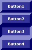
The following is the same layout featuring an inset border rather than an outset border.
When set side by side or one on top of each other with the outset border button, the inset border looks like a pressed button.
<style type=”text/css”>
.button {display:block; width:50px; padding:8px; border:10px outset #000099; background:#333399; color:white; text-align:center; font-weight:bold}
.button2 {display:block; width:50px; padding:8px; border:10px inset #000099; background:#333399; color:white; text-align:center; font-weight:bold}
</style>
HTML Structure:
<div class=”button”>Button1</div>
<div class=”button”>Button2</div>
<div class=”button2″>Button3</div>
<div class=”button”>Button4</div>
Pretty amazing. Many designers have tried to create this mouse rollover effect for years using javascript programming, mouseover commands, and other techniques. CSS made the process of creating CSS Rollover Menus much easier.
To create our CSS Rollover Menu, we created a division with the ID of buttonmenu inside our style sheet. Notice the 10px left margin for the overall division. This aligns the menu within our page style. You can change this to fit your own design. The list selectors are set to have no margins or padding and we’ve remove the bullets from the list by setting the list-style-type and list-style-image to “none”. The link style is set to with the 10px outset border and the hover style is set with a 10px inset border. We need to include the background color and text color in the hover so it will match the non-hover (inactive) state of the original, giving the appearance that only the border is changing.
#buttonmenu ul, #buttonmenu li {margin: 0; padding: 0; list-style-type: none; list-style-image:none}
#buttonmenu a {display:block; width:100px; padding:8px; margin:0; border:10px outset #000099; background:#333399; color:white; text-align:center; font-weight:bold}
#buttonmenu a:hover {position:relative; border:10px inset #000099; background:#333399; color:white;}
The HTML structure is very simple. We just do a list of links inside of a division called “buttonmenu”. When the mouse “rolls over” the link, the list design elements are triggered through the use of the anchor hover CSS selector.
<ul>
<li><a href=”cssfun.html”>Link1</a></li>
<li><a href=”cssfun.html”>Link2</a></li>
<li><a href=”cssfun.html”>Link3</a></li>
</ul>
</div>
There are many ways to the CSS Rollover Menus. Here are a few more examples of our CSS experiments with rollover menus. Move your mouse over the links (to this page) to test them.
<!–
#button2 {margin-left:10px}
#button2 ul, #button2 li {margin: 0; padding: 0; list-style-type: none; list-style-image:none}
#button2 a {display:block; width:100px; padding:8px; margin:5px; border:2px dotted #000099; background:#333399; color:white; text-align:center; font-weight:bold}
#button2 a:hover {position:relative; border:2px dashed #000099; background:#333399; color:white}
–>
</style>
<div id=”button2″><ul>
<li><a href=”cssfun.html”>Link1</a></li>
<li><a href=”cssfun.html”>Link2</a></li>
<li><a href=”cssfun.html”>Link3</a></li>
</ul></div>
We changed the border to dotted and the hover state to dashes. The border width is thin, only 2 pxs. Below, we thickened the border 8px for a different effect.
#button3 ul, #button3 li {margin: 0; padding: 0; list-style-type: none; list-style-image:none}
#button3 a {display:block; width:100px; padding:8px; margin:5px; border:8px dotted #000099; background:#333399; color:white; text-align:center; font-weight:bold}
#button3 a:hover {position:relative; border:8px dashed #000099; background:#333399; color:white}
Next, we’ve taken this experiment a little further and changed the border to solid and from blue to purple for the hover effect on the CSS mouse rollover.
#button4 ul, #button4 li {margin: 0; padding: 0; list-style-type: none; list-style-image:none}
#button4 a {display:block; width:100px; padding:8px; margin:5px; border:8px solid #000099; background:#333399; color:white; text-align:center; font-weight:bold}
#button4 a:hover {position:relative; border:8px solid #990099; background:#333399; color:white}
Putting all the techniques we’ve learned together, we’ve taken these same links and completely changed the text color, background color, and border color on the hover for a dramatic CSS Rollover Menu.
#button5 a {display:block; width:100px; padding:8px; margin:5px; border:8px solid #000099; background:#333399; color:white; text-align:center; font-weight:bold}
#button5 a:hover {position:relative; border:8px solid #990099; background:#CC66FF; color:#660066}
As you’ve seen, the technique to create pure CSS Rollover Menus isn’t that complicated. Use your imagination and see what you can create.
CSS Rollover Menus and Hover Features
- 2D Web Design – Create Stylish Menus with CSS
- Web Page Designer’s CSS Rollovers with Single Image
- Horizontal Menu Bar Using Style Sheets
- Juicy Studio CSS Styling a List as a Menu
- HTML CSS Text Rollovers
- CSS-2 Pure CSS Menus with No Javascript
Using Background Images in Links
Using the technique we discussed for our header featuring a background image, we can change the look and feel of the same boxes, with and without borders. Remember to include a background color for the division in case the background image doesn’t load or to be visible while waiting for the background image to load. Oh, and after you read through this basic introduction into background images in links, check out the wide range of CSS background possibilities in our CSS Tips and Tricks with Backgrounds and Transparencies and CSS Unleashed – Experiments with Background Images and Backgrounds.
Within the code below there is a background image An image placed within a CSS selector sits in the background, so to speak, of a page rather than on the page itself like an embedded graphic. Because the background graphic is within the style sheet code, when the style sheet is absent, such as with software for the blind and visually impaired, the graphic is invisible to the reader.
The background image is positioned relative to the container it resides in. The various declaratons include defining if the graphic is repeated, not repeated, and if repeated, how many times and in which directions; the relative position (top, bottom, left, right) within the container; and whether it is fixed or absolute. The repeating factor is based upon an x-y grid with repeat-x across and repeat-y vertical. We have ours set to not repeat and to sit in the left, bottom corner, fixed in place.
The background example below definitely has some problems. We show you this not as a showcase of what is possible, but more as an example of what NOT to do. We visit many web pages with such backgrounds where it is almost impossible to read the text. Not only impossible, it gives headaches more than information. Keep your backgrounds complementary and appropriate to showcase your content.
By using a dramatic but monochromatic background, your text is enhanced and the background is now a part of the overall design theme.
The examples below use our images and show how to use text and photography together to create interesting effects. You can find more examples in our article on CSS Unleashed – CSS Experiments Showcasing Your Photography. We’ve left the text plain to highlight the background in these examples, except for the last one where we had some showcase fun.
Photograph by Brent VanFossen.
Photograph by Brent VanFossen.
Marcel Proust
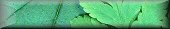
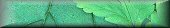
Let’s do another experiment and using the technique of CSS experiments rollover menus we highlight on one of our sample layouts which uses images for the background rather than colors.
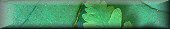
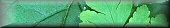
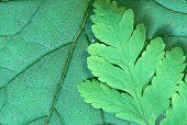 The technique uses the photograph seen to the right of this text and these four “buttons” graphically created from the original photograph.
The buttons are only visible on the hover, when the mouse moves over the link. They disappear after the mouse moves away from the link. There is a different hover class statement for each link, 1 through 4, which features the different background image.
The HTML structure is very simple and easy.
<ul>
<li class=”L1″><a href=”cssfun.html”>Link1</a></li>
<li class=”L2″><a href=”cssfun.html”>Link2</a></li>
<li class=”L3″><a href=”cssfun.html”>Link3</a></li>
<li class=”L4″><a href=”cssfun.html”>Link4</a></li>
</ul>
</div>
The style sheet code looks complex, but it isn’t really. Here is the full code. We have condensed the code using CSS shorthand.
#buttonpic ul, #buttonpic li {margin: 0; padding: 0; border:none; list-style-type: none; list-style-image:none}
#buttonpic a, #buttonpic a:active, #buttonpic a:visited {font-family: Arial Black, Arial, Helvetica, sans-serif; text-decoration:none; color:white; height:29px; background: transparent; width:170px; display:block}
#buttonpic a {vertical-align:bottom}
.L1 a:hover, .L2 a:hover, .L3 a:hover, .L4 a:hover, .L5 a:hover {text-decoration:none; border:none; width: 170px; display:block; height:29px; z-index:1}
#buttonpic .L1 a:hover {background:url(../images/web/leavesmenu_1x1.jpg) no-repeat green; color:#003300}
#buttonpic .L2 a:hover {background:url(../images/web/leavesmenu_2x1.jpg) no-repeat green; color:#003300}
#buttonpic .L3 a:hover {background:url(../images/web/leavesmenu_3x1.jpg) no-repeat green; color:#003300}
#buttonpic .L4 a:hover {background:url(../images/web/leavesmenu_4x1.jpg) no-repeat green; color:#003300}
Working with Cascading Style Sheets, the only limits are technical. Once you figure out the technical, the design possibilities are unlimited.
CSS Backgrounds – Links and Resources
- W3 Schools: CSS Backgrounds
- Making a Seamless Web Page Background
- Blooberry’s CSS Properties – Backgrounds
- Tizag’s CSS Backgrounds
- SouthernTwilight Tutorial CSS Backgrounds and Colors
- Your HTML Source – CSS and Backgrounds
- HTML Goodies – So You Want Information on CSS and Backgrounds, Huh?
- Cascading Style Sheets (CSS); Backgrounds
- Momps Web Design: Cascading Style Sheets – Backgrounds
- W3’org’s CSS-2 Colors and Backgrounds