Barest Essentials: Does Your Website Pass the Test Without a Style Sheet?
The most crucial test of a web page is to go naked. Totally without any clothing at all. To strip it to its barest essentials and see if it can still walk proudly through the streets. We worked hard to make our web site as accessible as possible. Part of the test is to strip all the fancy design work away and see if it is still readable and still viewable. You can also see this page as it should be seen, with all the pretty graphics, layout, and stylesheet elements.
If you view the code behind this page by clicking on the Internet Browser menu VIEW, SOURCE, you will see the code behind our page. 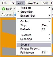 Look closely down the list, about line 36 and you will see that we have commented out the links to our style sheet (CSS - Cascading Style Sheet). We left it in so you could see where the code would be if it was working. Since it isn't working, what do you see on this page?
Designing web pages is a multi-fold process. It must look good for the eyes, get the content and intent of the page across, and still be viewable when stripped down to its barest essentials. 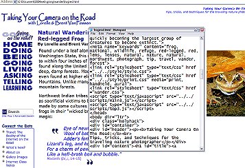 Inside our code, you will find javascripts, meta tags, structure code (HTML), style sheet references (DIV, SPAN, CLASS) and you will find two sets of style sheet links. One is for the presentation and the other is for other media such as print, handheld computers, and other devices. We've taken the extra steps to make sure our page is viewable by a wide range of equipment, but if we have overlooked something or if our pages are viewed by a system that doesn't recognize style sheets, what will the viewer see? The viewer will see what you are looking at right now, our pages minus all pretty design stuff. Does it still work?
Who Cares? Why Is This Important?
Who does care if your web page's code works with or without style sheets and presentation code? About 25% or more of the Internet users care about how your page looks. In a way, you might be denying 1 in 4 people the use of your page. The competition for web page viewers demands you try to be accessible to everyone, not just 3 out of 4 people.
Who are these Internet users? In general they are people who are blind, visually impaired, and disabled in one way or another. But this number also includes a lot of people who are still using older Internet browsers and software that doesn't recognize style sheets and a good number of users in academia who can't stand all the graphic heavy pomp and circumstances in web pages and use browser software like Lynx which strips all the graphics and presentation styles away to get to the material they are really interested in.
To pass the test for access without style sheets, pay close attention to the following characteristics of a well designed page:
- Viewable
- Readable
- Content Flows Around Graphics
- Content Flows in Proper Context
- Navigation Links Viewable and Accessible
- All links visible and accessible
- Section Headers (titles) Distinguishable from Text
Content Flows in Proper Context
The flow of the content needs to be in its proper context. This means that the document should be readable and make sense as you read it. Designing a web page using the old technique of tables, a page is laid out in a grid. Viewed in its highly graphical form, it looks pretty and reads well, the content flowing through the document alongside the pretty pictures and design elements. Take the structure of the tables away and what do you have? Often a chunky mess that is readable but it doesn't make sense as you read it.
Just like magazines and newspapers, the content columns on web pages allow text to flow in and around boxes, advertising, and graphics. Or at least it should. When you strip the layout from your page, where do all those boxes, advertising, and graphics go? Do you find a pull quote that should be with paragraph C sitting between paragraphs F and G making little sense? Does the picture of the car sit next to the paragraph about the car or the paragraph about the tiger? How does it look when there is nothing left to support the flow of the content?
Designers store relative tips and information often in boxes, floated along the edges of the page, but with the actual code often placed haphazardly among the context of the page. Place these box codes within the content so that the boxed material matches the content when all the pretty design elements are stripped away and the content can flow within the context of the material.
What Can You See?
What do you see that is different, other than the lack of design, on this page compared to our normal layout? You should see is text with a few pictures scattered about. You still see headers that look bold and prominent in some way, and links highlighted normally. What is missing is all the pretty design elements, the background graphics, the layout, the structure, the colors in the headers and special effects we put in to make our pages look pretty. Instead of customized colors, the default colors recognized by your software are in place.
What else can or can't you see? The photographs are still there. In the middle of this paragraph is a code for a photograph of a grizzly bear's feet close up. If the style sheet was working, the photograph would be aligned along the right margin of the column, with the text wrapping around it.  Because the style sheet reference is gone, the photograph just sits along with the text as if it was a character, a letter or word in the text, and the text just goes on. Resize the window and the photograph will stay with the text. The background graphics, such as seen on our pages normally, are gone. Every page in our site hosts a background graphic in the header section of our Taking Your Camera on the Road logo. What now replaces it is the small statement we have at the top of every page that says: Taking Your Camera On The Road: Tips, tricks, and techniques for the traveling nature photographer. Even without our logo at the top, does this page still look good and do you know what the web site is about?
Flow of Content Helps Search Engines
When re-designing our web site recently, it was very important that we have as much as the content at the top of the page as possible so that the search engine robots could scan the content first and then get to the navigation. Many search engines search only the top 25-50% of a page before moving on. This means that the further down in the code your content, the more trouble they will have visiting your site.
Take a moment to look at the bottom of this page if you haven't already. If you noticed in the code behind the page, the javascripts we use are all found here, and they still show up on the page. But they also lack their presentation style, with distinctive graphic bullets and colors.
The graphic that features our main site navigation (HOME, DOING, BEING, GOING...) in the form of an image map. This means that the image has been broken up into sections which correspond to links. Even without the presentation style, the image map links still work.
The nature photograph at the bottom is part of a javascript, as is the quote below and the photo tip below that. Normally these appear in nice boxes in the first column you would see on the page. The content is still there, but they aren't as pretty.
At the very bottom are the main links to access the different sections or "zones" within our site, as well as critical links to information about us, contact information, copyright, and legal issues. Most of our links within the sidebar section, which is now pushed down at the bottom of this page, are actually inside of Javascript code. These are visible on this page if you have a browser that is Javascript enabled. If you didn't, you wouldn't see the list of links to other articles within our web site. Search engine robots and spiders can't read Javascripts, so they pass over these looking for content.
Search engines work by following one link within a page to another page within your site, and another and another, like a spider linking a web together. Without these internal links between your pages, search engine robots and spiders can't follow their way through your site. We've provided links in text form (|HOME | DOING | BEING | ...) to the main sections (zones) of our web site at the bottom of every page free of Javascript or other encoding to help the search engines move through our pages.
We hope our example page is a good lesson for you. By making your page's content still readable for those using non-graphic Internet browsers, you help them, make your site accessible to all, and help search engines get to your content faster. We believe in Open Source sharing of code information, since we learned from others who shared their knowledge of web page design with us. Go on, try it. Remove your linked style sheet reference and see if your page passes the test.
And if you want to see what these page would look like with the style sheet in place, we've duplicated a copy for you.


